Take a look at YouTube's new changes to its platform
YouTube introduced some new changes to their popular video viewing platform which include a new look to feature such as gestures.
Key highlights:
- One of the first changes in the design include a change in the logo
- They also added new Library and Account tabs that give you easy access
- YouTube introduces the gestures feature
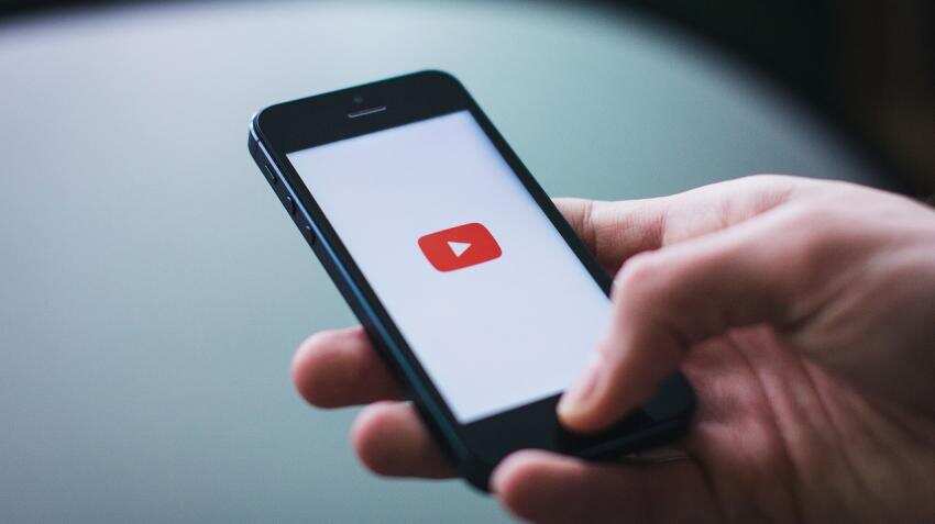
YouTube announced some new changes to their popular video viewing platform, including a new refreshed look to the site after nearly 12 years. One of the first changes in the design include a change in the logo where instead of the word ‘Tube’ being highlighted in red in the earlier logo, the new one will sport just a red play icon with the words YouTube displayed in black besides it.
The new design will YouTube says will bring a new level of functionality and a more consistent look across their desktop and mobile experiences.
Neal Mohan, Chief Product Officer of YouTube in a blog statement said, “We’ve made the header white to let content take the lead and moved the navigation tabs to the bottom of the app so they’re closer to your thumbs. We also added new Library and Account tabs that give you easy access to what you’re looking for.”
Besides this, YouTube has brought a new feature called gestures that allow a user to double tap on the left or the right of the phone screen to fast forward or rewind a video for 10 seconds.
Added to this Mohan said that they will also be introducing another gesture feature which allows users to swipe to the next video or the previous video.
Another feature that will be introduced to the mobile app of YouTube will enable users to watch videos at the pace they want.
Soon, the YouTube player will seamlessly change shape to match the video format the user is watching, such as vertical, square or horizontal. This means that people will be able to watch even vertical or horizontal videos without any black bars at the sides.
There is also another feature that lets a user view a row of suggested videos while they are watching in full screen.
The company said they had also worked on a new desktop design for the platform.
“My favorite feature of this new desktop design is Dark Theme, which turns the background dark while you watch for a more cinematic look,” said Mohan.
“We know this is a lot of change, but we want to make clear that there’s one thing that stays the same: YouTube’s mission. We’re here to give people a voice and show them the world – no matter what device they use,” said Mohan.
ALSO READ:
Get Latest Business News, Stock Market Updates and Videos; Check your tax outgo through Income Tax Calculator and save money through our Personal Finance coverage. Check Business Breaking News Live on Zee Business Twitter and Facebook. Subscribe on YouTube.
RECOMMENDED STORIES

Rs 3,500 Monthly SIP for 35 years vs Rs 35,000 Monthly SIP for 16 Years: Which can give you higher corpus in long term? See calculations

Power of Compounding: How long it will take to build Rs 5 crore corpus with Rs 5,000, Rs 10,000 and Rs 15,000 monthly investments?

Looking for short term investment ideas? Analysts suggest buying these 2 stocks for potential gain; check targets
SCSS vs FD: Which guaranteed return scheme will give you more quarterly income on Rs 20,00,000 investment?

Small SIP, Big Impact: Rs 1,111 monthly SIP for 40 years, Rs 11,111 for 20 years or Rs 22,222 for 10 years, which do you think works best?
04:08 PM IST





 Could Facebook's Watch take on YouTube, Netflix, Amazon Prime Video?
  Facebook, YouTube, Twitter, Microsoft come together to form counter-terrorism forum
 Now enjoy Netflix, Youtube on Bharti Airtel’s Internet TV for Rs 4,999
 YouTube unveils India mobile app for spotty internet signals
 Google launches YouTube TV in bid to compete with Netflix, Amazon for video makers